 As we encourage you to adopt our new responsive environment, we know that you want options when choosing your new website design. We’re proud to introduce you to Gabe, our fifth responsive template and our second release of the year.
We’ve listened and learned over the past several months, and we’ve designed Gabe to include many unique features to better serve your customers when they visit your website, from a prominent search bar to refined navigation.
Gabe represents the current movement toward clean design that focuses on highlighting your brand’s identity and key information with minimal distractions. Learn more about Gabe’s features, and explore all of our new responsive template options in the Template Publisher within your Merchant Admin.
Gabe's Standout Features
Prominent Search
If your instincts tell you that the search bar is the first stop in the majority of your customers’ journeys to your catalog, you are correct. Through both our internal data collection on how customers are navigating our websites as well as extensive external research, we’ve learned the importance of including an impossible-to-miss search bar in your website header.
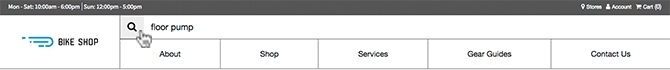
We’ve also recently made improvements to how search functions on all of our websites. With our newest responsive template, your website visitor’s experience will be vastly improved from visibility of search to speed of search to relevancy of search.
New Information Banner
In previous template designs, information including store name and hours as well as store locator, account and cart icons have been integrated into the header design. With Gabe, these elements have been moved to a banner above the main header content, allowing for improved visibility of key information in each area. As with our other templates, these items can be enabled or disabled based on your preference.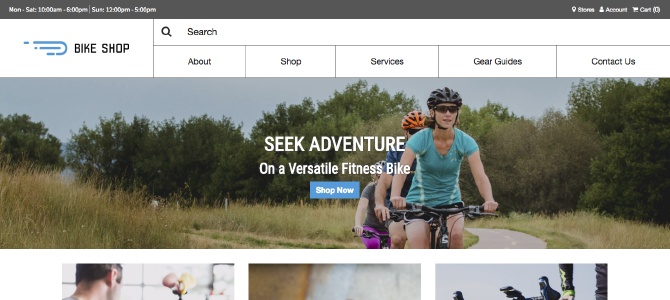
Improved Tablet Navigation
With Gabe, your navigation now shifts to a hamburger menu on the tablet view. The hamburger menu is the expandable three line indicator to the left of the search bar that is increasingly recognizable to web users as the source for navigation on smaller displays. This feature allows you to include relevant items in your top level navigation without resulting in a crowded, difficult to navigate tablet experience.
Get Started With Gabe
Gabe is now available in the SmartEtailing Template Publisher. Like our other templates, configuring Gabe to include your logo and brand colors is easy using our Theme Editor. Ready to migrate to one of the new responsive website templates? Contact support for help or complete this form to get started.
Comments