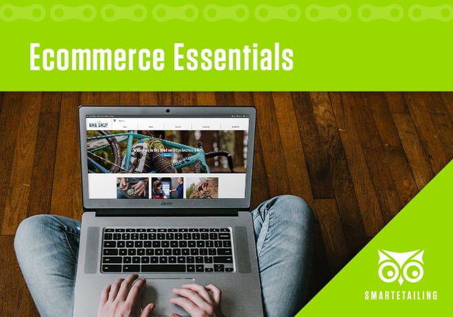
 As a SmartEtailing retailer, you have powerful ecommerce capabilities baked into your website. From displaying your current inventory with complete product details to an integrated checkout process, you have the functionality consumers expect from a modern retail website.
But is your website optimized to convert website browsers into buyers?
Review these essential practices for setting up and maintaining your website. If you aren’t yet checking all of these boxes, you’re not taking full advantage of your SmartEtailing website. If you don’t know where to start or if you know that delegating this work to our team of talented marketing professionals is the ideal option for your business, we’re here to help.
Clear, Concise Header and Navigation
Your website header and navigation are utilities. These sections should help visitors quickly find what they want with as little effort as possible. While there are appropriate ways to represent your brand in this area, you should never compromise the user’s needs in favor of excessive design flourishes or experimental features.
In the header, include your logo, a prominent search function, a store locator, and cart and account links. In the navigation, feature catalog content, service content, and a limited amount of community and business information. Keep the number of menu options to a minimum, keep navigation titles short, and direct your site visitors to your top business priorities.
Well Merchandised Homepage
An organized and properly maintained homepage not only helps your customers find what they want but it also allows you to promote products and services that are seasonally appropriate for your business needs.
At the top of your homepage, feature new product arrivals or seasonally appropriate categories, closeouts on overstocked or aging inventory, and compelling services. Refresh this content often. Just as you change up the displays in your store on a regular basis, you should update your homepage content to reflect changing seasons, changing inventory levels, and changing consumer preferences.
Organize your evergreen homepage content by category, creating logical groupings of products, services, and community information that allow visitors to scroll quickly down the page and identify what they want based on informative section headings and useful content clusters.
While there is no perfect rule of thumb for the right length of a homepage, generally limit scrolling to a few flicks of the thumb. Rotate content on and off your page instead of continuously adding additional sections.
Prominent, Clear Calls to Action
Every piece of content on your website should serve a purpose. Include a call to action (CTA) within each content block to optimize conversions (and to validate that the content does indeed serve a purpose - if you can’t think of a logical CTA, remove that content).
Make your CTAs, whether they are buttons or hyperlinks, noticeable and differentiated from other content. That doesn’t mean that you need animated flame GIFs on your Hot Deals content but your button and link color should stand out and assist the user in taking the next action.
Consistent User Experience
Consistency - in headlines, button styles, page headers, and other site elements - helps reduce the amount of processing that visitors need to do as they navigate or browse your website. Make it easy for visitors to scroll down your homepage and spot what they need or want.
Consistency also builds trust. If visitors navigate from your homepage to your bike service page to your policies page, they should have no doubt that they are on the same website. If navigating your site feels like a tour of different fonts, formatting, and design aesthetics, you’re creating subconscious confusion and diminishing brand trust in the visitor’s mind.
Accurate, Visible Policy Information
If you offer free in-store pickup and free shipping on qualifying purchases, don’t keep it a secret! Work these selling points into headings on your homepage and be sure to link to a complete Policies & Shipping page in your footer.
Why It All Matters
Creating a positive user experience on your website has many benefits, both to you and your potential customers. You’ll see improved conversion rates and decreased bounce rates with a well-designed website. Your customers will easily find the cycling goods that they want, and they’ll return to your site or your store if they have a satisfying shopping experience.
Remember to always think about mobile users and speed on your website and your homepage. Make sure your content looks good on a phone and loads quickly. Site speed is essential to ecommerce businesses, and your choices make a difference.
Everyone wins with a positive ecommerce user experience. It’s foundational to your website’s success which, in 2020 and beyond, will play an increasing role in your business’s success.

Comments