
We are excited to announce that on Monday, September 25th, SmartEtailing is beginning a phased rollout of our new responsive website templates and associated content management tools. This update represents a major innovation which we expect will make your life easier and improve results from your website.
Our team has worked tirelessly for over a year on this project, conducted countless hours of testing, and performed over twenty beta installations for real-world exposure. The resulting software product is a highly-functional, fully-responsive, catalog-enabled bike shop website platform that will carry your business into the future.
What’s new?
This latest software release includes several significant enhancements that represent a fundamental overhaul of SmartEtailing as you know it.
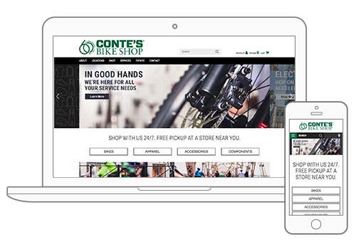
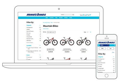
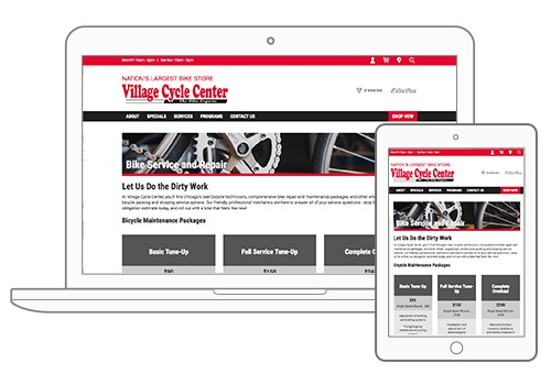
Responsive templates
We are releasing three new customizable responsive templates available for your SmartEtailing website. These new templates have been completely re-architected to deliver cross-device functionality, improve site load speed, improve organic SEO, and enhance the consumer shopping experience.
Responsive page builder
Creating a responsive template environment wasn’t enough. We needed to create a set of intuitive design tools that empower you to create great looking and fully responsive content on your site without any coding knowledge. Our marketing strategy, design and development teams worked to create a drag and drop tool that delivers pre-formatted content options that you can customize along with more flexible design functions for advanced users. With this tool, you can create compelling content that works across all devices, improving the look and function of your website.
Responsive footer builder
Website footers are often overlooked for their importance to a quality website, but it was very important to our team that we created an easy-to-use tool for our clients to create website footers that look and function great. The tool leverages the same architecture of the responsive page builder but includes unique content types and special formatting to accommodate the style settings of each website template.
Theme editor
In designing our new templates, we had the goal of making it simple for you to configure site settings to match your brand. Our new Theme Editor feature offers an intuitive interface for you to customize colors, fonts, and styles on your website to help distinguish your business locally.
What does phased rollout mean?
For a software release of this scale, it is common for technology companies to release the latest version in phases. This allows for the most efficient collection of user data and enhancements with smaller groups of clients.
We are releasing the new responsive templates to retailers in groups of 50 for each of the first two months (October and November). At that point we will evaluate results and determine the next steps for full release.
Regardless of the specifics of the release process or which phase your business is in, we fully expect that all retailers will have access to the technology during the winter. Any retailer who is motivated to upgrade before the 2018 selling season will have access in time.
We will eventually sunset prior versions of the SmartEtailing software and all retailers will be asked to upgrade. Because of the demands of today’s modern website environment, the supporting software application behind these templates was changed significantly and retailers who upgrade will not be able to revert back to legacy templates.
Why do I want a responsive website?
Responsive web design means that the content of a website automatically adjusts to fit a device’s screen size and orientation. When you turn your phone sideways to get a wider view and the web page turns and scales to fit the width, that’s responsive design at work. Responsive design happens on the back end of the site, in the coding. It is one of the most important ways of creating a positive user experience for a consumer.
Shoppers expect to find exactly what they want with a few taps of their thumbs. Most consumers research their purchases online—comparing brands, stores, and reading reviews—before making a purchase. Responsive design makes the user experience better regardless of the device at their fingertips.
With our updated responsive templates, your site will load faster and create a positive impression in the shopper’s mind. A recent analysis by Google revealed that over 50% of online shoppers who encounter a non-responsive website are less likely to engage with that brand. Google has also updated their search algorithm to give preferential treatment to responsive websites to serve favorable user experiences to mobile shoppers.
How do I learn about responsive migration?
We’ve prepared information to help as you consider the best timing and strategy for you to leverage this update for your business. This overview includes a brief description of our new responsive templates, what your options are for migrating to one of our new templates, and how you can start planning your migration.
Learn more about migrating to responsive SmartEtailing.
Ready to Get Started?
Please complete this form and we'll be in touch soon to discuss your responsive migration. To speak with Barbara about your options, please call 303-527-0676 ext. 102.
Comments