We begin with the generation-old question: How can I sell more product online or get more customers in my store who find me online?
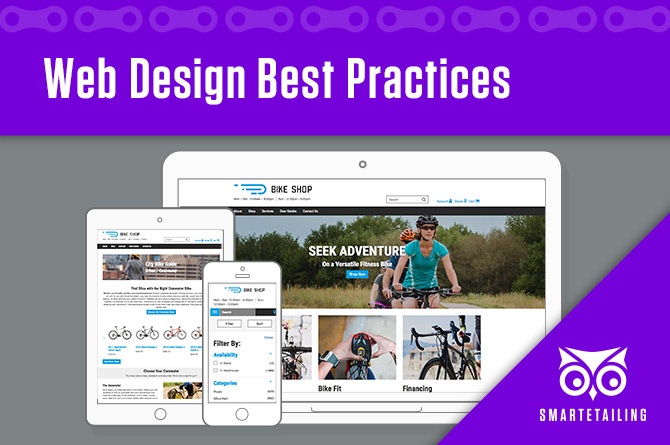
For starters, your site MUST work on mobile. According to Hubspot, a leader in CRM and sales software, 81% of shoppers conduct online research before making big purchases. Also, mobile commerce makes up 30% of all U.S. ecommerce. How do you get your SmartEtailing site to be mobile friendly? Request a free responsive website consultation, view your options to become mobile friendly, or read our quick start guide to making your website responsive.
Optimize for Online Selling
According to Hubspot, 76% of consumers want a website that makes it easy for them to find what they want. It’s that simple. Or is it? It can be, with these web design tips to optimize your site for the best customer experience. Web design best practices are used by the biggest brands to increase traffic and conversions.
1. Header
The strip at the top of your site that contains your logo, main navigation, and search bar.
- Your header is the first thing your visitor sees; think mobile first, less is more. What impression does your header make? Is it cluttered and difficult to navigate? Clean and easily understandable?
- Your logo is the main visual element. Your logo should link back to the homepage from other internal pages.
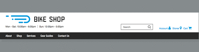
- Your navigation accounts for all the main areas of your website and is the main way customers find their way around. When creating your main navigation menu, put yourself in the mindset of a first time visitor. What words would they be looking for? Too many options will be overwhelming...and try to avoid industry jargon.
- Your search bar is consistently one of the most used elements of any retail website.
- Keep images out of the header. Images add file weight to the site and affect performance, while also pushing important content down the page.
- Keep clutter out of the header. This is not a good place for other random content. Those items can live in the body of the homepage. Remember, think mobile users first.
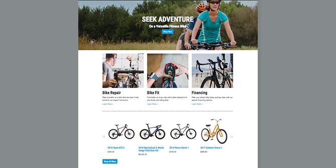
2. Body
The largest portion of your page typically serving as a table of contents for the site, merchandising your products and presenting a clear path for users to explore your business.
- You’re selling a product or service. Make sure you clearly showcase your product and services on your homepage.
- Have a call-to-action high on your homepage. Multiple calls-to-actions are helpful to effectively engage users and improve your site's organic search ranking.
- Don’t overload your site with photos or graphics. You want to leave white space on your website. This allows viewers to have an easier time navigating your site. Remember, search engines cannot read images and it is important to add alt text to all images on your website. Fewer images also helps you maintain faster page load speeds.
3. Footer
A conclusion of all content; found at the bottom of all pages.
- Keep the design simple. Footer size is often connected to the amount of information and number of pages on your website.
- Link to your information. The two most important links are to utility pages like locations, contact, or financing pages.
- Include basic contact information. Include your main phone number, email address and physical address.
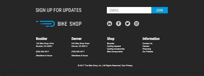
- Organize your footer links. Group like footer items. Place each group under a header so that every element is easy to find.
- Include social media icons. 72% of websites include social media icons/ links in the footer.
- Include a call-to-action. Give visitors something to do (Email signup, social icons, etc).
- Be aware of contrast and readability. Content is usually small. Think about color, weight and contrast between the text elements and background. Simple typefaces are key. Website accessibility is an important consideration in digital design.
Need Help?
Want SmartEtailing’s help in migrating your site to responsive and getting set up with web design best practices? Click on buttons below to get started or learn more.


Resources:
https://blog.spinweb.net/how-to-effectively-structure-your-website-header https://blog.spinweb.net/how-to-use-google-custom-search-on-your-website https://mayvendev.com/blog/15-tips-for-creating-a-great-website-footer https://blog.hubspot.com/blog/tabid/6307/bid/34006/15-examples-of-brilliant-homepage-design.aspx
https://www.crowdspring.com/blog/small-business-web-design-best-practices-and-tips/ https://www.hubspot.com/marketing-statistics
Comments